Create your very own Auto Publish News/Blog Site and Earn Passive Income in Just 4 Easy Steps
9 Tips for Creating High-Converting Emails
There are several CCD principles, all of which can be applied to email marketing. I'll show you how.
1. Meet the expectation created by the subject line
This tip isn't just about design. As a solid foundation, your entire email must be coherent in its single goal – from the subject line to the call-to-action within it. This means not using misleading tactics that trick subscribers into opening your email. This is the opposite of CCD and results in lower conversions.
Additionally, your email should be targeted as promised by both your subject line and the content of your email. No bait and switch: What gets your subscriber to open and click should do exactly that. It should be about providing a consistent journey, starting from the subject line all the way to the landing page. This maintains expectations and helps build trust in the long term.
For more information on how to get opens, clicks, and conversions, check out these subject line tips from email experts.
2. Consider verbs that tease in your CTAs
No amount of design can help a bad call to action (CTA). So before we talk about design considerations, make sure you get your CTA on point.
A good CTA not only reinforces the process but also increases its value.
Your subscribers didn't wake up with the intention of downloading or signing up for something. Instead, they may have woken up wanting or needing something. Your button text should reflect the latter, giving a sense of – or building expectations of – what your subscriber will encounter next.
| To sell a… | Instead of… | Try this… |
| Project management app | Download now. | Start planning. |
| How-to blog post | Learn more. | Show me how. |
| A pair of sneakers | Buy today. | To run faster. |
3. Draw focus to your CTA through encapsulation
Encapsulation is the packaging in which you put the most important contents. The idea is to make it clear to the reader that the content is important to them. An example would be centering a CTA within a tunnel or window. This could be achieved through photography, a pattern, or a radial gradient.
 Use a background image to draw attention to the CTA
 A radial background can draw attention to the CTA
Interested in this approach? Learn how with these helpful blog posts:
4. Make your CTA stand out with contrast
The transition to our considerations of barrier-free design is formed by well-considered contrasts. Designing with CCD in mind is all about ensuring your CTA contrasts with other elements in the email and therefore stands out.
At CCD we also look at color psychology as it can be used to create an emotional response from your subscribers:
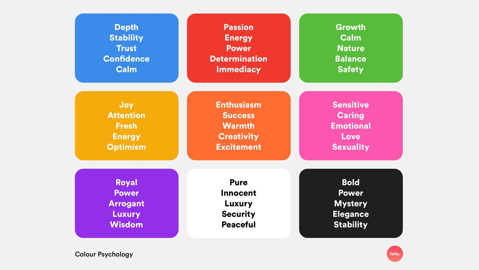 Source: UX Planet
For the greatest possible contrast, the Interaction Design Foundation recommends using colors that are opposite each other on the color wheel.
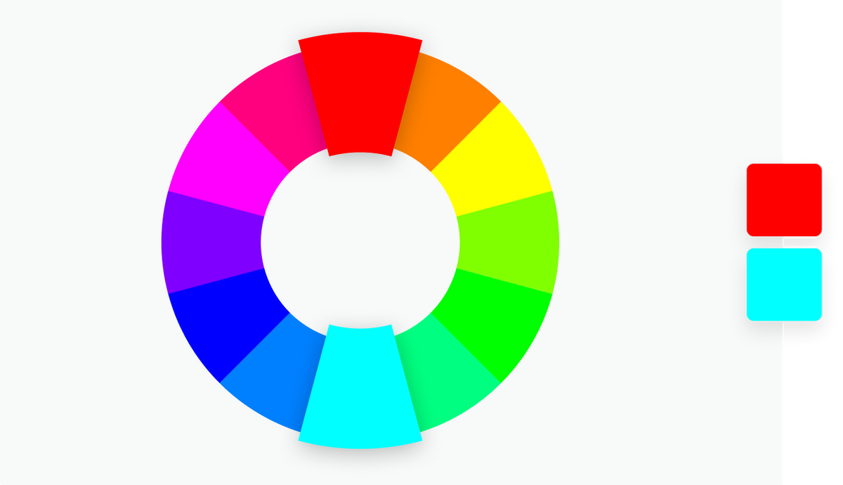 Source: Canvas Color Wheel
However, not all color contrasts work well for all readers. So be sure to test the contrasts within your own brand's color palette to ensure email accessibility.
5. Point out important content with directional cues
Directional cues are visual indicators that point to important content and help subscribers take action. Examples of such clues include arrows, lines, shapes, and lines of sight.
You can literally use arrows to point out important content, guide readers through an email, and direct them to clickable elements. Lines and shapes can have the same effect, but are much more subtle.
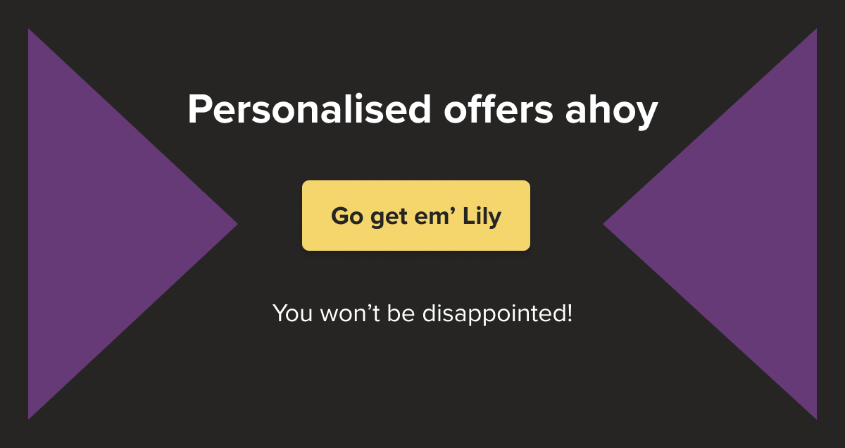 Highlight important elements using arrows to point to the CTA
Photography allows you to create pathways and use the line of sight of human photography to direct the reader to specific elements.
 Line of sight: The model in the image is looking at the bottom left where the CTA is located
6. Leave plenty of white space to make CTAs easier to find
Leaving lots of white space in a composition makes it easier for subscribers to find areas in an email where they can take action. A good example is the white space around a CTA. Center positioning and generous padding at the top and bottom help draw the eye to a button or designed text link.
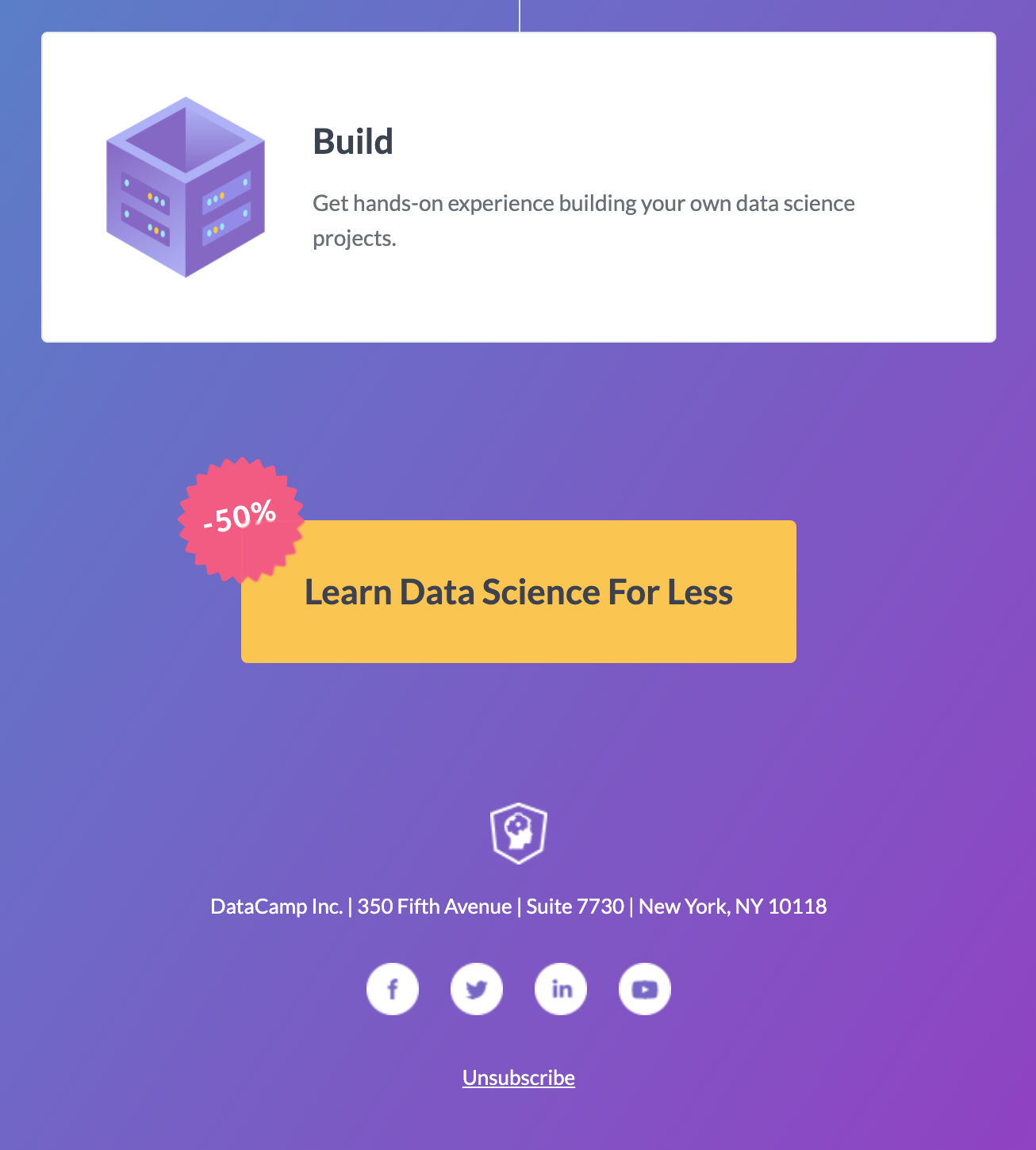 Source: Really Good Emails
The final button in the email at the top has enough white space to ensure it isn't missed and also contains a clear offer reminder.
7. Give people a taste of what they're about to get
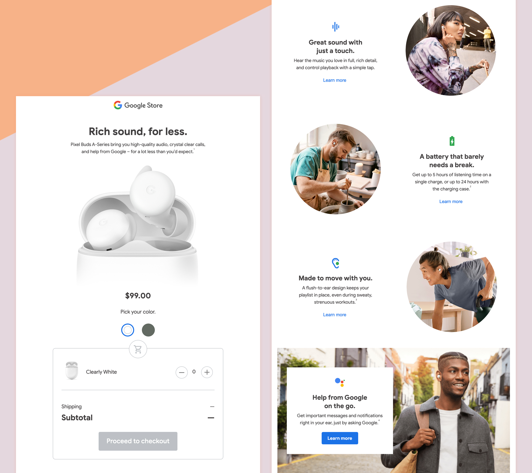
Show, don't tell. The old saying “A picture is worth a thousand words” is true. People want to see or get a preview of what they are getting before they commit to action. Is it worth your time and money? Email design is perfect for showcasing your product or service.
 Source: Really Good Emails
Google introduces its Pixel Buds wireless headphones in this interactive promotional email. The subscriber can study the product with enlarged images in the hero area. Additional images in the body of the email show examples of the product used.
Interactivity offers an even more immersive experience with the ability to switch between colors, add the item to the cart and click checkout. This is a great way to increase conversions through interactivity as it shortens the path to purchase.
8. Use urgency to inspire action
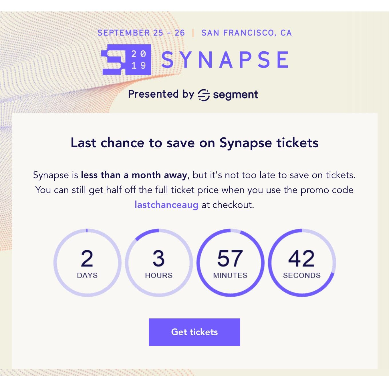
Sending emails with a sense of urgency — like “early bird pricing ends,” “1 day to…” or “starts in 1 hour” — can drive action by reducing the time it takes to make decisions.
Visual techniques and elements like countdown timers, bold and large typography, shorter messages, and CTAs that are visible upon opening can help subscribers take action quickly.
 Source: Really Good Emails
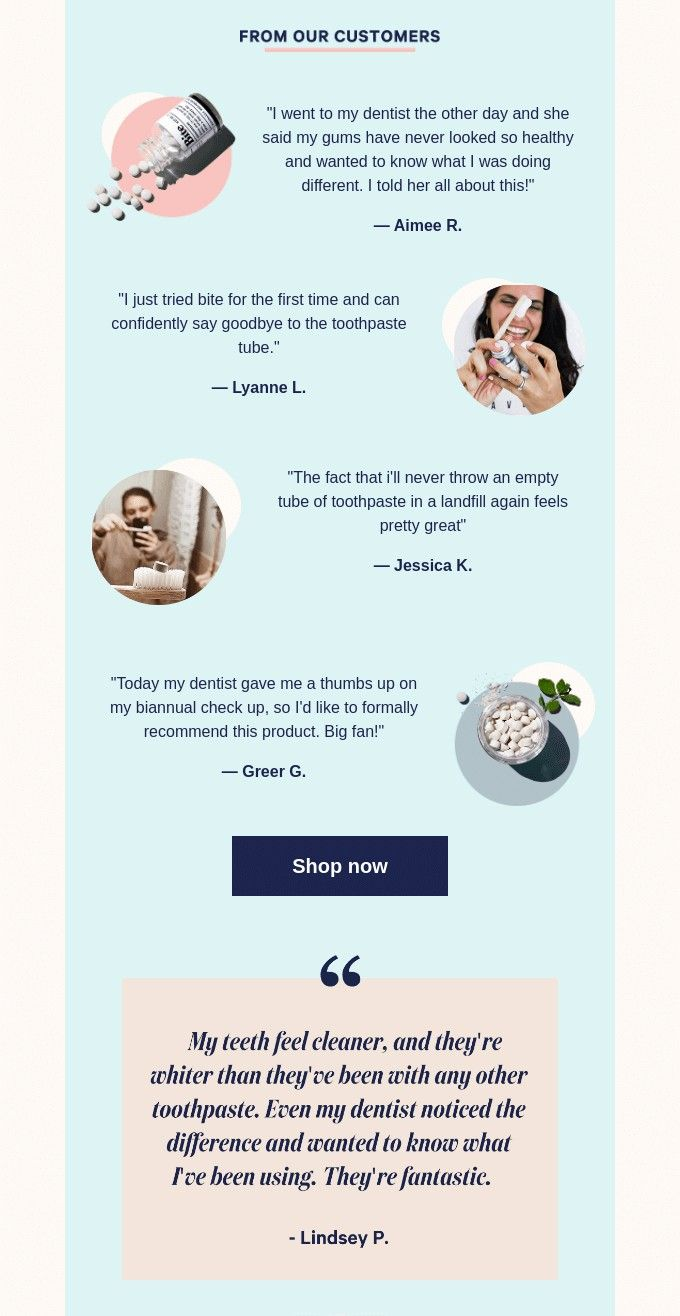
9. Build trust through social proof
Incorporating positive customer feedback about your product or service can increase trust and give potential customers the extra confidence they need to take action. This can be in the form of a testimonial, a review or a star rating.
 Source: Really Good Emails
The path to conversion is clear
On average, people only spend 10 seconds reading an email. Therefore, it is important that skimmers understand the context of your entire email without having to read the text. Conversion-centric design is one way to take this into account and quickly draw your subscribers to your call-to-action before they lose interest. Try the tips in this article to pave the way to conversion and let us know how it goes!
Create your very own Auto Publish News/Blog Site and Earn Passive Income in Just 4 Easy Steps
